Surfer SEO – Unwrapped 2024
Overview
Role
Growth Designer – Led end-to-end visual execution:
Translated data into interactive landing page
Designed reusable motion & visual components
Coordinated across Marketing, Product, and Engineering
Project Scope
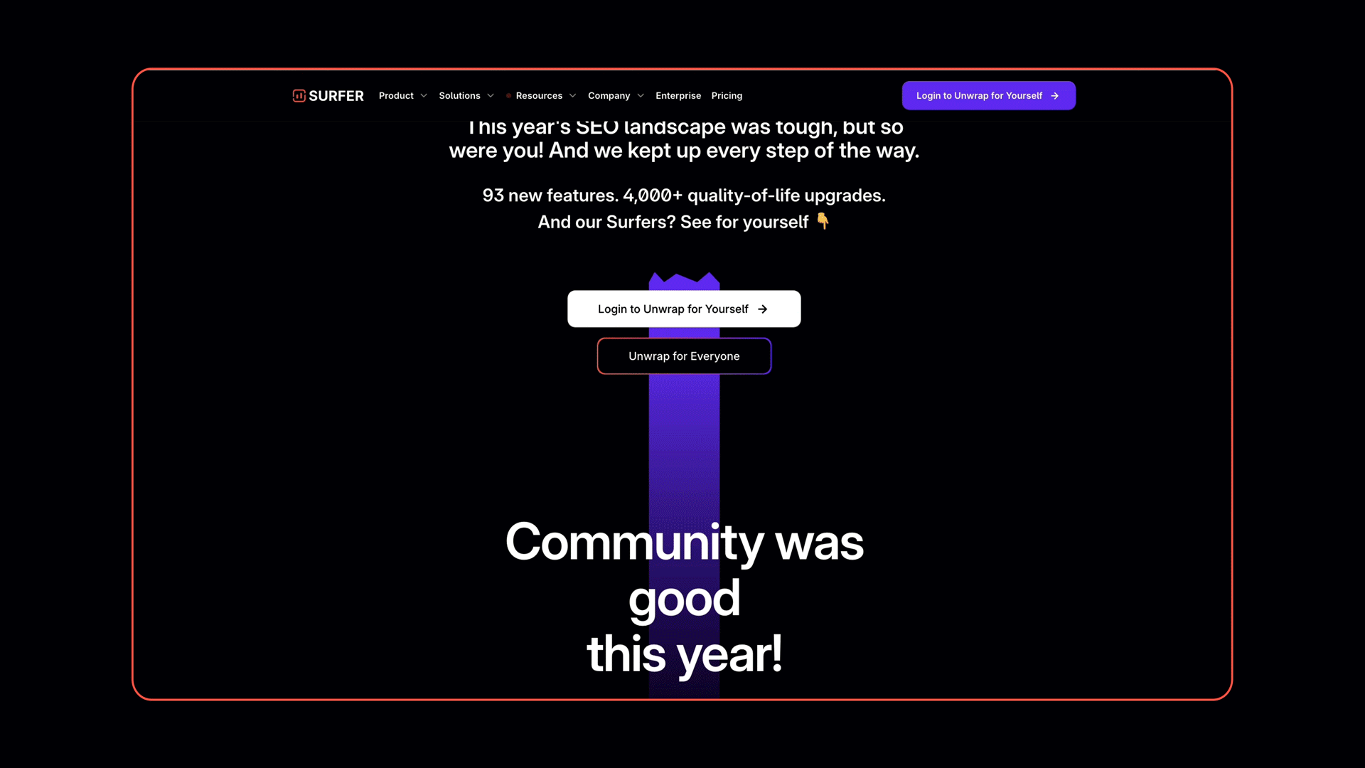
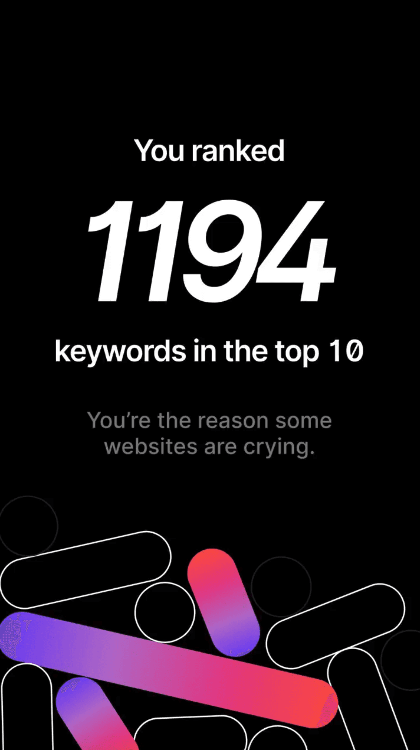
Problem: Surfer SEO needed to showcase users' annual SEO progress in a compelling way.
Solution: A modular design system covering:
Landing page (personalised data visualisation)
Campaign video (using existing footage)
Cross-channel assets (social/email)
Categories
SaaS
Landing Page
Data Visualisation
Motion
Team
Surfer SEO
Content
🔍 Research to Visual Mapping
🧭 UX Flow Snapshots
🎨 Design Previews

Summary
Core Problems:
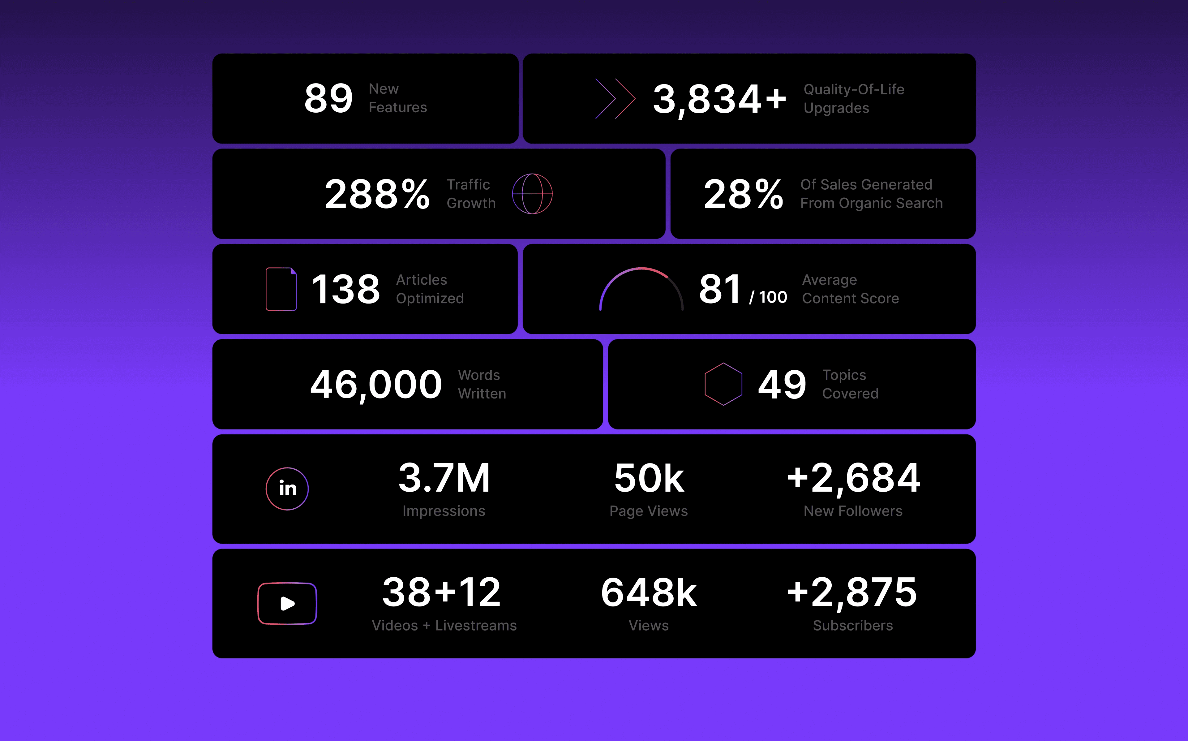
Data overload: How to present 10,000+ SEO metrics clearly
Tight timeline: 6-week production with mid-project pivot from video to landing page focus
Stakeholder alignment: Needed buy-in from Marketing (story), Product (data), Engineering (feasibility), and Leadership
Objectives:
Increase app re-engagement via personalised reports
Drive new user sign-ups
Create reusable assets for future campaigns

(02) How We Cracked It
Phase 1: Storyboarding & Planning
Audit raw data
Mapped all available SEO metrics (keywords, traffic, rankings)
Identified 6 key insights worth highlighting (e.g. "Top Performing Page")
Hand-drawn storyboarding
Sketched narrative flow: Hero → Key Metrics → Call-to-Action
Defined "Aha moments" (e.g. animated growth curves)
Stakeholder workshop
Aligned on priority metrics with Product
Locked in technical constraints with Engineering
Process Thinking Flow
Early hand-drawn frames storyboarding

Text brief to storyboarding and visual elements


This system powered multiple campaigns from one master file, cutting production time to 1/3.
Phase 2: Design System Development
Built reusable components:
Data viz widgets: Animated charts for key metrics
Motion templates: Standardised animations for consistency
Colour/icon library: Campaign-specific palette
Figma prototyping:
Created interactive demo of scroll-triggered animations
Tested with Marketing team weekly
Engineering handoff:
Delivered modular design elements
Annotated motion specs


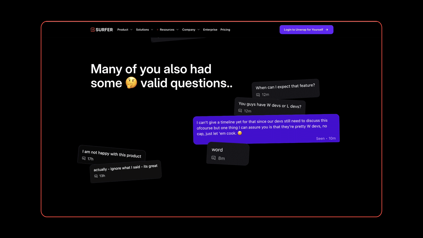
Phase 3: Cross-Channel Adaptation
Landing page structure:
Above fold: Personalised headline + hero visual
Mid page: Interactive data explorer
Footer: Contextual CTA (upgrade/share)
Asset repurposing:
Social ads: Animated chart snippets
Emails: Static data visualisations
Video: Motion graphic transitions


(03) Key
Deliverables
Landing Page
Personalised data dashboard
5 interactive visualisations
Responsive layout
Design System
12 reusable Figma components
Motion guidelines
Cross-channel adaptation rules
Production Pipeline
Frame.io review system
Engineering documentation
(04) Measured
Outcomes
Team Efficiency:
Reduced approval rounds from 5 → 3
40% faster asset production for paid ads
User Engagement:
1.8x higher CTR vs. campaign average
Positive feedback on data clarity

(05) My Take
Good growth design is about making complexity feel inevitable – not simplified.
This project taught me:
Prototyping is negotiation – Motion demos prevented 20+ hours of debate
Systems beat one-offs – Our components are still paying dividends
Data stories need acts – Users engage with 'before/after' arcs
What I'd bring:
The ability to turn half-briefs into shippable systems
A toolkit for aligning creatives and engineers
Passion for making metrics mean something
Surfer SEO – Unwrapped 2024
Overview
Role
Growth Designer – Led end-to-end visual execution:
Translated data into interactive landing page
Designed reusable motion & visual components
Coordinated across Marketing, Product, and Engineering
Project Scope
Problem: Surfer SEO needed to showcase users' annual SEO progress in a compelling way.
Solution: A modular design system covering:
Landing page (personalised data visualisation)
Campaign video (using existing footage)
Cross-channel assets (social/email)
Categories
SaaS
Landing Page
Data Visualisation
Motion
Team
Surfer SEO
Content
🔍 Research to Visual Mapping
🧭 UX Flow Snapshots
🎨 Design Previews
Summary
Core Problems:
Data overload: How to present 10,000+ SEO metrics clearly
Tight timeline: 6-week production with mid-project pivot from video to landing page focus
Stakeholder alignment: Needed buy-in from Marketing (story), Product (data), Engineering (feasibility), and Leadership
Objectives:
Increase app re-engagement via personalised reports
Drive new user sign-ups
Create reusable assets for future campaigns
(02) How We Cracked It
Phase 1: Storyboarding & Planning
Audit raw data
Mapped all available SEO metrics (keywords, traffic, rankings)
Identified 6 key insights worth highlighting (e.g. "Top Performing Page")
Hand-drawn storyboarding
Sketched narrative flow: Hero → Key Metrics → Call-to-Action
Defined "Aha moments" (e.g. animated growth curves)
Stakeholder workshop
Aligned on priority metrics with Product
Locked in technical constraints with Engineering
Process Thinking Flow
Early hand-drawn frames storyboarding
Text brief to storyboarding and visual elements
This system powered multiple campaigns from one master file, cutting production time to 1/3.
Phase 2: Design System Development
Built reusable components:
Data viz widgets: Animated charts for key metrics
Motion templates: Standardised animations for consistency
Colour/icon library: Campaign-specific palette
Figma prototyping:
Created interactive demo of scroll-triggered animations
Tested with Marketing team weekly
Engineering handoff:
Delivered modular design elements
Annotated motion specs
Phase 3: Cross-Channel Adaptation
Landing page structure:
Above fold: Personalised headline + hero visual
Mid page: Interactive data explorer
Footer: Contextual CTA (upgrade/share)
Asset repurposing:
Social ads: Animated chart snippets
Emails: Static data visualisations
Video: Motion graphic transitions
(03) Key
Deliverables
Landing Page
Personalised data dashboard
5 interactive visualisations
Responsive layout
Design System
12 reusable Figma components
Motion guidelines
Cross-channel adaptation rules
Production Pipeline
Frame.io review system
Engineering documentation
(04) Measured
Outcomes
Team Efficiency:
Reduced approval rounds from 5 → 3
40% faster asset production for paid ads
User Engagement:
1.8x higher CTR vs. campaign average
Positive feedback on data clarity
(05) My Take
Good growth design is about making complexity feel inevitable – not simplified.
This project taught me:
Prototyping is negotiation – Motion demos prevented 20+ hours of debate
Systems beat one-offs – Our components are still paying dividends
Data stories need acts – Users engage with 'before/after' arcs
What I'd bring:
The ability to turn half-briefs into shippable systems
A toolkit for aligning creatives and engineers
Passion for making metrics mean something